
Web Architecture, even the website actually needs an architect.
Reflections on the importance of the architecture of a website and its semantic structure. What to think about and why today a website is the most important seller of a company.
The architecture of a website is a complex thing that contemplates different types of aspects starting from the hosting and then from the hardware infrastructure up to the so-called front-end of the site, that is what users see and read by typing a name of domain in the address field of your browser.
Basically the process of creating a website and its architecture does not differ at all from the same processes that are taken into consideration for the construction of a building, there are intrinsic, extrinsic issues, the use of materials, the morphology of the land, etc ... If desired , for the web we could talk about intrinsic and extrinsic issues, materials etc…
Here, however, we would like to focus on the visible part, the one that the user sees when he opens the site, without going into the intrinsic, non-visible and structural part, otherwise a book would be needed and perhaps it would not even be enough.
Because, let's face it, one of the problems that sector operators almost always face is: how should the pages be composed? What actions do you want to encourage? What do you want the user to perceive? Generally the client is asked for the contents (texts, images, iconography), a simple subdivision of the more or less nested pages but then the question is left to the web-designer. Let him smazzuolarsi to find the square. And most of the time it's wrong.
Educate clientsia understanding all the technical implications for the creation of a website, making them understand the semantic infrastructure that their sales tool should have, should be one of the tasks of those who deal with online communication in all its aspects, but it is not always easy, in fact, it is very difficult because often you come up against the very poor preparation, even general, of the customer who does not understand, for example, the difference between a TAG and a CATEGORY, between an H1 and an H3 and what are the implications and above all the aspects that can be useful in order to make the site truly effective.
And so, in front of the texts provided by the customer of ABOUT US, of the SERVICES provided or of the PRODUCTS sold and the more or less articulated CONTACTS page, the web designer invents the home-page which is in fact the most important and representative page of a site. But making things up on an empirical basis is never a good solution. The result is always bad and translates into very high bounce-rates, poor readability and usability, no conversions and no insights into the internal pages of the site unless you arrive directly from search engines almost more by chance and luckily than by chance. will.
Let's face it also clearly, producing websites that you know from the beginning that they won't have any success and become only a showcase for recognizing the graphic qualities of the web designer, over time becomes a little boring and almost counterproductive. But without the customer's collaboration, either you have 6-figure budgets available or you have to invent, hoping they'll catch us.
That the era of low-priced websites is over has been in the air for a while. Even if almost automated systems are born everywhere for the simplified production of 1&1 or WIX-style websites, the substance of the matter does not change and these actually only conceal customer acquisition operations to sell much more.
So, hence the question: dear customer, what do you want the customer to see, read, perceive and do when they open the home page of your site?
The dry and also correct answer would be: go to the product page, choose the product and contact me and then purchase.
If you think so!
What is important for the customer to understand and it is up to us to make him understand is that the site is not a box where to throw content written without a minimum of reasoning, without following the rules of the game.
The customer must understand that for every action there is a counter-reaction and that this can also be negative or even worse a non-action which is the worst thing that can happen. A website doesn't have to be beautiful, it has to be effective and effectiveness depends first of all on the architecture and on the quality of the contents immediately afterwards (or maybe even vice versa).
Therefore:
How should the menu be done? From which and how many voices should it be composed? How should it be written?
What should appear in the header? and in the leotard? and in the footer? Need a slider? Yes? No? And if so, what function should it have? Should it contain a call to action? What predominance must it have with respect to the body? And in the body do you need to be informative? Up to what level? Or should it contain references to product/service pages? Should the home page bring relevance to the internal pages? If yes, how. How to split headings html (H1, H2, H3 … etc…) and how to structure their wording and fonts.
But then, the pictures … Here the darkness is pitch black. The customer generally provides a set of images (when he is good and diligent) which often have no relevance to the content, with what the user is expected to do. But the images must have their precise location, they must have a sense, they must play a role within a web page, especially if the web page is the home page. Image titles, descriptions, abstracts, are all important elements that are underestimated if not forgotten and the results can then be seen.
But then the architecture, on the front-end side, is not just that. Do we want to use a “boxed” or “wide-screen” format? What are the differences, advantages and disadvantages of one versus the other way of displaying content? Do we want a responsive website? Yes of course!
And the colors? Which colors to choose? What kind of colors to match? Choosing the color palette with which to build a site is one of the most important moments, often underestimated and left to the taste and skills of the web designer but it is a serious mistake.
Should the site structure be open to updates and modifications or should it be a closed structure which will not undergo changes in content over time? Here too, the objectives change completely and above all this has a heavy impact on the type of architecture.
But then, even doing everything right, the crux of everything remains one: the web is semantic. Tim Berners-Lee wrote and said it with the invention of the World Wide Web and if this statement is correct (and it is) all the more reason a website needs a structure or rather an architecture that responds to semantic needs and dynamics .
For example, one of the main errors faced where an incorrect evaluation of certain processes can be noted is the semantic field of relevance of a website
In other words: a non-optimal if not bad positioning of the site in search engines may depend on an incorrect interpretation of the semantic field of relevance of the search engine website. In even simpler terms: what are you talking about? what do you sell? What are you doing? Who are you? You choose which question to answer but give it correctly so that search engines understand well and can give relevance to the underlying contents.
But obviously it is not only useful for search engines but also and above all for users. Anyone arriving on the home page of a site wants to understand in less than a second if what they are about to look at is important, relevant to their search and if the information it contains can be of use to them. Otherwise the rebound coefficient rises and good night, lost potential customer.
So the final question is this: when you are finally about to have a website, do you want to win or do you want to lose? Because remember that defeat on the web is terrible and difficult to recover, it is not enough to renew a site if you continue to make the same mistakes.
Then, it is clear that a real bible would be needed to dissect every single aspect but at least it is necessary to try to make customers aware of these aspects before proceeding with the design and then with the programming of a website. Forewarned is forearmed.
You may also be interested in:

Innosuisse has achieved its 2023 innovation goals in Switzerland
A record amount of over 490 million francs has been allocated to compensate for the lack of association with the EU's well-known Horizon Europe program
by Editorial staff Innovando.NewsEditorial staff of Innovando.News
“I'm selling, but I'm staying”: the new trend of the small entrepreneur
The story of Francesco Schittini and Emotec's entry into the MCP fund is exemplary of frequent changes of ownership without organizational shocks
by Alberto NicoliniEditor of districtbiomedicale.it, BioMed News and Radio Pico
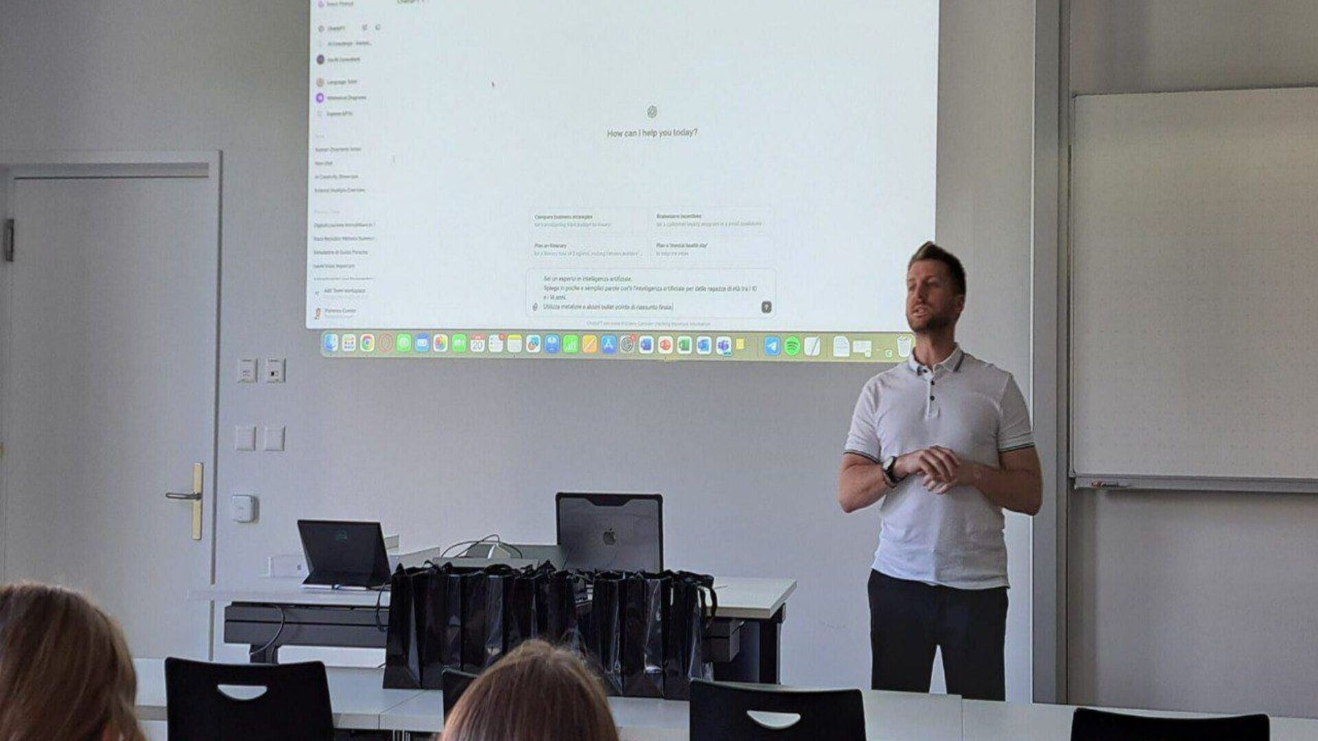
AI Tools for Businesses, the course dedicated to artificial intelligence
The Swiss start-up navAI developed it with the aim of providing all the tools necessary to implement the new technology in its sector

There was a backdoor to infect them all, but one genius saved the web
Here's how the expertise of a developer, and a little... providence, just prevented the sabotage of Linux and the entire Internet

 //
//